Stephanie Evergreen on Creating Better Handouts
A handout is a short, condensed version of all the key points, URLs, and references mentioned in the slideshow. It may even have tiny visuals that match the slideshow to visually cue the audience member’s memory. The handout is a useful support for viewers’ efforts to put in place the things they learned in the talk. Here’s a current handout that belongs with the slide deck above:
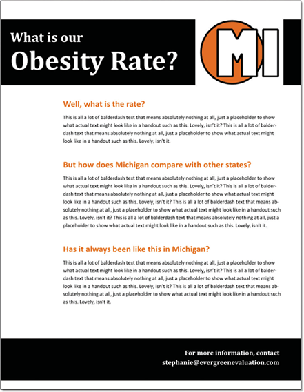
A handout is a useful summary of a talk
Evergreen.Handouts1
Audiences like handouts because they are, well, handy. They summarize the key points, free up the audience to listen, and look really great pinned to an office wall.You have a few choices when it comes to the kind of handout you distribute. Option A is a detailed handout where you have pasted in the key points from your notes.
A detailed handout contains your notes
Evergreen.Handouts2
You’ll tell the audience, “You are welcome to take notes but I have a handout for you with all of my key points that I will pass out as you exit.” Why as they exit? So that your audience members do not read your handout instead of listening to you speak.Option B is a semiblank handout where you have pasted in just your main topic areas, leaving plenty of empty space for audience members to take their own notes.You will want to include in the handout any URLs, references, or resources— anything you wouldn’t want the audience to have to copy from a slide. But the rest of the handout leaves each audience member the room to construct a document that will be most helpful after the workshop. This handout works best when you know each person will take away different lessons from your presentation.Sometimes I’ll create a hybrid of these two options, leaving the handout fairly empty but typing in some of my key points.Your choice between these two handout options will hinge a bit on your audience needs. A CEO, for example, probably does not want to create her own handout. She wants you to give her one that already has all the detail. On the other hand, certain groups can’t just sit and listen. Teachers are a great example of this kind of crowd (I know, I used to be one). They have to be multitasking. They’ll be in a professional development meeting, knitting while they listen. This group would benefit from keeping their hands busy and creating their own handout.
With a blank handout, audience members construct their own takeaway points
Evergreen.Handouts3
Put dense material on a handout
Evergreen.Handouts4
One more option to consider: Whenever you have something dense, like a table or a complicated diagram, put it in a handout. No one wants to look at that thing on a big screen. Pass it around so each person can examine it up close, take notes, and refer to it later. Your goal here is to deliver to your audience members an easily accessible document that contains a high-level overview and gives them a resource for getting more information if they need it. You should aim for something that they will want to hang on their walls. Or refrigerators. I know this isn’t exactly a presentation handout, but I think it illustrates my point. This flyer came from my kid’s school. It probably looks pretty similar to what you retrieve from your kids’ backpacks too.
Weak handout
Evergreen.Handouts5
On the back of the newsletter, you can see that the story at the top is about the events happening at the local museum over the summer. That same day, we also received the museum’s flyer.
Effective handout
Evergreen.Handouts6
One of these landed on my refrigerator and one of them went into my recycling bin. I’m sure you can see the differences that make a difference. While both use images of children, the school’s flyer uses cheap-looking clip art while the museum’s has an actual photograph that looks fun and engaging. Both handouts use color. The school’s handout is printed on blue paper, probably under the assumption that the paper color would make it stand out from all of the other junk that comes home with my kid. The museum flyer uses one color as an organizing tool. It sections off different events and structures the page so it is more readable. The real distinction here is not money or time (the museum is free—it has no large graphic design department) or even software (you can make effective handouts in Publisher or even PowerPoint).No, the real distinction is that someone at the museum learned the nitty-gritty about how to present information effectively. Handouts are a way to meet people where they are with however much information they need from us at that time. The few people in the audience who are hungry for more can follow a URL in the handout to obtain the full report. But for the majority of our audience, the handout will be their next step in our presentation adventure.
Presenting Data Effectively, now in its second edition, shows readers how to make the research results presented in reports, slideshows, dashboards, posters, and data visualizations more interesting, engaging, and impactful. In the book, Stephanie Evergreen guides students, researchers, evaluators, entrepreneurs, and non-profit workers—anyone reporting data to an outside audience—through design choices in four primary areas: graphics, text, color, and arrangement.


