When reading a visualization is what we see really what we get?
This post originally appeared on the Medium blog Multiple Views: Visualization Research Explained.
It summarizes and accompanies our paper “Surfacing Visualization Mirages” that was presented at CHI 2020 with a best paper honorable mention and was written collaboratively by Andrew McNutt, Gordon Kindlmann, and Michael Correll.
TL;DR
When reading a visualization, is what we see really what we get? There are a lot of ways that visualizations can mislead us, such that they appear to show us something interesting that disappears on closer inspection. Such visualization mirages can lead us to see patterns or draw conclusions that don’t exist in our data. We analyze these quarrelsome entities and provide a testing strategy for dispelling them.
Introduction
The trained data visualization eye notices red flags that indicate that something misleading is going on. Dual axes that don’t quite match up. Misleading color ramps. Dubious sources. While learning how visualizations mislead is every bit as important as learning how they are created, even the studious can be deceived!
These dastardly deceptions need not be deviously devised either. While some visualizations are of course created by bad actors, most are not. Even designs crafted with the best of intentions yield all kinds of confusions and mistakes. An uncareful or careless analyst might hallucinate meaning where there isn’t any or jump to a conclusion that is only hazily supported.
What can we say about the humble bar chart below on the left? It appears that location B has about 50% more sales than location A. Is the store in location A underperforming? Given the magnitude of the difference, I’d bet your knee jerk answer would be yes.
Many patterns can hide behind aggregated data. For example, a simple average might hide dirty data, irregular population sizes, or a whole host of other problems. Simple aggregations like our humble bar chart are the foundation of many analytics tools, with subsequent analyses often being built on top of these potentially shaky grounds.
What are we to do about these problems? Should we stop analyzing data visually? Throw out our computers? Perhaps we can form a theory that will help us build a method for automatically surfacing and catching these quarrelsome errors?
Enter Mirages
On the road to making a chart or visualization there are many steps and stages, each of which are liable to let error in. Consider a simplified model: an analyst decides how to curate data, how to wrangle it into a usable form, how to visually encode that data, and then finally actually how to read it. When the analyst makes a decision, they exercise agency and create an opportunity for error, which can cascade along this pipeline, creating illusory insights.
Something as innocuous as defining the bins of a histogram can mask underlying data quality issues, which might in turn lead to incorrect inferences about a trend. Arbitrary choices about axis ordering in a radar chart can cause a reader to falsely believe one job candidate is good while another is lacking. Decisions about what type of crime actually counts as a crime can lead to maps that drive radically different impressions about the role of crime in a particular area.
““any visualization where the cursory reading of the visualization would appear to support a particular message arising from the data, but where a closer re-examination would remove or cast significant doubt on this support.””

We all thirst for insight in visual analytics (or anywhere else). This desire can cause us to overlook important details or forget best practices.
Mirages arise throughout visual analytics. They occur as the result of choices made about data. They come from design choices. They depend on what you are trying to do with the visualization. What may be misleading in the context of one task may not interfere with another. For instance, a poorly selected aspect ratio could produce a mirage for a viewer who wanted to know about the correlation in a scatterplot, but is unlikely to affect someone who just wants to find the biggest value.
The errors that create mirages have both familiar and unfamiliar names: Drill-down Bias, Forgotten Population or Missing Dataset, Cherry Picking, Modifiable Areal Unit Problem, Non-sequitur Visualizations, and so many more. An annotated and expanded version of this list is included in the paper supplement. There is a sprawling universe of subtle and tricky ways that mirages can arise.
To make matters worse, there are few automated tools to help the reader or chart creator know that they haven’t deceived themselves in pursuit of insight.
Do these things really happen?
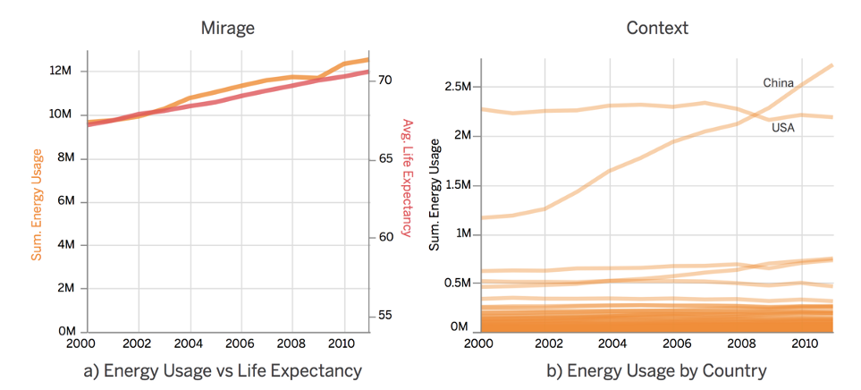
Imagine you are curious about the trend of global energy usage over time. A natural way to address these questions would be to fire up Tableau and drop in the World Indicators dataset, which consists of vital world statistics from 2000 to 2012. The trend over time (a) shows that there was a sharp decrease in 2012! This would be great news for the environment, were it not illusory, as we see in (b) when checking the set of missing records.

Source: https://arxiv.org/abs/2001.02316
If we try to quash these data problems by switching the aggregation in our line chart from SUM to MEAN, we find that the opposite is true!! There was a sharp increase in 2012. Unfortunately this conclusion is another mirage. The only non-null entries for 2012 are OECD countries. These countries have much higher energy usage than other countries across all years (d).
Source: https://arxiv.org/abs/2001.02316
Given these irregularities we can try removing 2012 from the data, and focus on the gradual upward trend in energy usage in the rest of the data. As we can see on the left, it appears that energy usage is tightly correlated with average life expectancy, perhaps more power means a happier life for everyone after all. Unfortunately this too is a mirage. The y-axis of this chart has been altered to make the trends appear similar, and obscures the fact that energy use is flat for most countries.
Now of course, you’re probably saying:
But I’m really smart, I wouldn’t make this type of mistake
That’s great! Congrats on being smart. Unfortunately, even those with high data visualization literacy make mistakes. Visualizations are rhetorical devices that are easy to trust too deeply. Charting systems often give an air of credibility that they don’t necessarily warrant. It is often easier to trust your initial inferences and move on. Interactive visualizations with exploratory tools that help to might dispel a mirage are often only glanced at by casual readers. Sometimes you are just tired and miss something “obvious”.
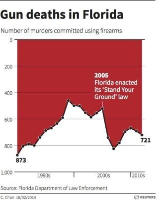
This infamous chart appears on first glance to be saying that ‘Stand Your Ground’ decreased gun deaths, but on closer inspection it shows the opposite! Terrifying! (The author of this chart wasn’t actually trying to confuse anyone, they were just trying to explore a new design language). Source: Reuters
Some visualization problems are easy to detect, such as axes pointed in an un-intuitive or unconventional direction or a pie chart with more than a handful of wedges. This type of best practice knowledge isn’t always available, for instance, what if you are trying to use a novel type of visualization? (A xenographic perhaps?) There’d be nothing beyond your intuition to help guide you.
Other, more terrifying, problems only arise for particular datasets when paired with particular charts. To address these we introduce a testing strategy (derived from Metamorphic Testing) that can identify some of this thorny class of errors, such as the aggregation masking unreliable inputs that we saw earlier with our humble bar chart.
Testing for errors is easy if you know the correct behavior of a system. Simply inspect the system and report your findings. In errors in the hinterlands of data and encoding we are left without such a compass. Instead, we try to find guidance by identifying symmetries across data changes.
The order in which you draw the dots in a scatterplot shouldn’t matter, right? Yet, depending on the dataset, it often can!!! This can erase data classes or cause false inferences. We test for this property by shuffling the order of the input data and then comparing the pixel-wise difference between the two images. If the difference is above a certain threshold we know that there may be a problem. This is the essence of our technique: for a particular dataset, execute a change that should have a predictable result (here no change), and compare the results.

A simple scatterplot can hide the distributions it displays through draw order. This problem won’t affect every dataset, but here it hides the prevalence of the Americas in the middle of the distribution. Source: https://arxiv.org/abs/2001.02316
While it’s still in early development, we find that this approach can effectively catch a wide variety of visualization errors that fall in this intersection of matching encoding to data. These techniques can help surface errors in over-plotting, aggregation, missing aggregation, and a variety of other contexts. It remains an open challenge on how to effectively compute these errors (as their computation can be burdensome) as well as how to best describe these errors to the user.
Where does that leave us?
Visualizations, and the people who create them, are prone to failure in subtle and difficult ways. We believe that visual analytics systems should do more to protect their users from themselves. One way these systems can do this is to surface visualization mirages to their users as part of the analytics process, which, hopefully will guide them towards safer and more effective analyses. Applying our metamorphic testing for visualization approach is just one tool in the visualization validation toolbox. The right interfaces to accomplish this goal is still unknown, although applying a metaphor of software linting seems promising. For more details check out our paper, take a look at the code repo for the project, or watch our CHI talk.
About
Andrew McNutt is a PhD student in computer science at the University of Chicago. His work focuses on information visualization in general, and on automated guidance systems (like linters), unusual or xenographical data visualizations, and web applications as a visualization medium specifically. In the very near past he worked as a Data Visualization Engineer for a variety of companies in San Francisco, where he made visual analytic software. He got a formal education in physics from Reed College in Portland, and an informal education in web development from App Academy. He really like deserts, buffalo, and motorcycles. He’s excited about InfoVis, applied category theory, dashboards, testing, and pretty much anything in the wild world of javascript.
Gordon Kindlmann is an Associate Professor in the Department of Computer Science at the University of Chicago. His researches image analysis and data visualization to improve the computation of imaging-based science. Science pairs measurement tools that produce experimental data with computational tools to process the data. Advances in scanned imaging modalities (like MRI and confocal microscopy) are constantly increasing the speed, resolution, and sophistication of image measurements. Scientists can now form hypotheses and conduct experiments faster than they can find or create the computational analysis best matched to their new image data. Unfortunately, the process of creating new software remains slow or opaque for many people, and advances in parallel computing (required for large images) complicate the process even for experts.
He collaborates with physical and biomedical researchers who acquire image data to answer scientific questions. His research simplifies how informative visualizations are created, and improves how relevant image features are detected, sampled, and quantified. He is also interested in the theoretical and perceptual bases of effective data visualization and fosters re-usable and reproducible computational science by making all his research software open-source.
Michael Correll is a research scientist at Tableau Software, where he works in the area of information visualization. He is particularly interested in seeing how we can use the perceptual system to better communicate complex statistical concepts to general audiences, but he is also interested in text analytics, statistical graphics, uncertainty visualization, and the intersection of visualization and machine learning.
He was a postdoc at the UW Interactive Data Lab at the University of Washington Department of Computer Science, supervised by Jeff Heer. He received his PhD. from the University of Wisconsin-Madison Department of Computer Sciences in August, 2015.