How Do I Arrange the Sections of the Whole Report?
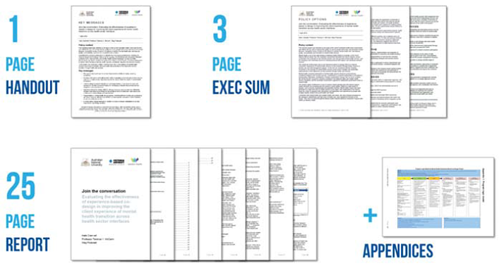
It’s time to zoom out of the layout of a single page or poster or slide and starting thinking about how we package the whole deal into something coherent for our audiences. It’s time to talk about how a well-formatted recommendations page doesn’t have much impact when it is buried on page 104. This is how we make reporting less cumbersome, particularly in a digital reporting era. Of course your reporting will probably include a slide deck. I mean, you could totally give a talk with no slides. People would look at you. And you would be awesome. But most of the time you’ll have a slideshow, designed with the principles we’ve been discussing throughout this book. The idea of the presentation is generally to spark conversation and get people interested in learning more about your ideas, Rock Star. So what next? Now that you have piqued their interest, you—what?—toss them a 300-page report and wish them luck? Sounds like a terrible way to foster engagement. Instead of giving people a new doorstop, you can extend their engagement with a handout. Something digestible. In fact, this is where the 1–3-25 model comes in handy. This model recommends that your reporting include a 1-page handout, a 3-page executive summary, and a 25-page report. In each of these layers, readers gain more and more detail. They can stop anytime, having already gotten the high points. This approach provides a scaffolding toward learning in which each step helps readers learn a bit more without being completely overwhelmed. The example in Figure 5.28 comes from an Australian university research institute that requires all researchers to publish by this model and makes templates to fit it. Smart! (See http://aphcri.anu.edu.au/aphcri-network/research-completed/joinconversation- evaluating-effectiveness-experienced-based-co.)Of course it’s hard to squeeze your work into just 25 pages, especially when you include graphics and data visualizations. So you’ll need an appendix—this is where you can put things like your logic model, methodology, and p values. And it can even be a separate document that you just link to from the others. So let’s talk about that 25-page report and what it’s going to look like. We normally go about structuring our reports (and presentations and posters) like this:
Background
Literature Review
Methodology
Discussion
Findings
Conclusion
It feels serious and logical and rigorous. Does it look familiar? Probably so, because it’s the basic format for a journal article. It’s just that a journal article is not the usual dissemination forum for the work many of us do, where our charge is to present data useful to decision makers, where we are paid to provide actionable information.Davidson (2007) wrote a life-changing article on this matter, reorienting us toward truly user-focused reporting, in which we do not make the reader wait until page 104 to get to the good stuff. Today’s readers just don’t have the patience for that. They might flip through a huge report to glean highlights, but few read, word for word, anything so long and tedious. In fact, there’s a hashtag for just this scenario: #TLDR, which means “too long, didn’t read.”The revolution in reporting is simple: Arrange the sections of the report in the reverse order. Report the findings and conclusions first. That’s what people are there to learn, so give it to them. If they are satisfied, you are done! If they have questions, you have explanations, because that’s your discussion, methodology, literature review, and background. Reporting in reverse values their time. It means the executive-level members of your audience can go on and use your findings to make strategic decisions while the few statisticians in the room can hang out until the end and talk nerdy with you. Reporting in reverse puts the audience first.

Presenting Data Effectively, now in its second edition, shows readers how to make the research results presented in reports, slideshows, dashboards, posters, and data visualizations more interesting, engaging, and impactful. In the book, Stephanie Evergreen guides students, researchers, evaluators, entrepreneurs, and non-profit workers—anyone reporting data to an outside audience—through design choices in four primary areas: graphics, text, color, and arrangement