Tips on Data Viz

The basics
For most of us, the fun bit of working with data and statistics is the visualization aspect. Many of us are visual learners, or at least understand information best when it’s simplified into a picture. This is especially true when dealing with data and statistics, which hide the meaning and significance of the information it carries behind numbers and variables. No one looks at the data set below and immediately thinks, “Got it, the construction industry’s contribution to U.S. GDP is rising again after the Great Recession. Easy.”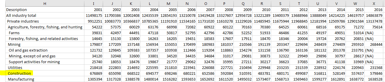 Just looking at a data set is not enough (to the inexperienced eye) to identify patterns in the numbers – we need a representation to more quickly and easily communicate the meaning and significance to our readers. For instance, the construction data in chart form relays the same information, but in a much more understandable way.Thanks to Excel, almost everyone who has used a computer in school or for business in the past 15 years can create a simple chart like a bar or line graph. (And if you haven’t, the online resources available are infinite.)However, even if you are a seasoned Excel user or chart builder, below are some practices you should keep in mind as you work on your next visualization.
The breakdown: Top Tips on Creating Data Visualizations
- Ask yourself, “What do I want to show in my chart?” Do you want to show a comparison, trend over time, or relationship among data sets? All of these are great options, but one chart type will usually represent the information better than others. Here’s a quick guide compiled by Dr. A. Abela to help you narrow your options to the best choice.
- Minimize the number of variables in your chart to avoid confusion. What does the reader need to know to understand the significance of the information? Limit the chart to those items.
- Keep the focus on the data, not the visual. It’s tempting to go all out and create a complex visualization using graphic design, but sometimes simplicity is best because you avoid distorting the information or leaving it open to misinterpretation.
- Provide context. Don’t assume the reader will immediately understand the information the chart is trying to impart – provide a brief title or subtitle as needed. Be sure to indicate what is being measured (people? U.S dollars? Squirrels?) in the title or in any labels.
- Provide a detailed citation. “Census Bureau” is not going to cut it! Big sources like the Census Bureau release thousands of data sets on an annual basis – help the reader who wants to find and use the chart’s underlying data by providing the name of the report or data set and a direct URL.
For more information on how to create the best data visualization, check out Data Visualisation, A Handbook for Data Driven Design by Andy Kirk!
