Creating a graphical abstract for your next paper
By Miguel Balbin, Science Communicator at Animate Your Science and PhD Candidate at the University of Adelaide. He is part of the team serving as Mentors in Residence for December 2021.
TLDR
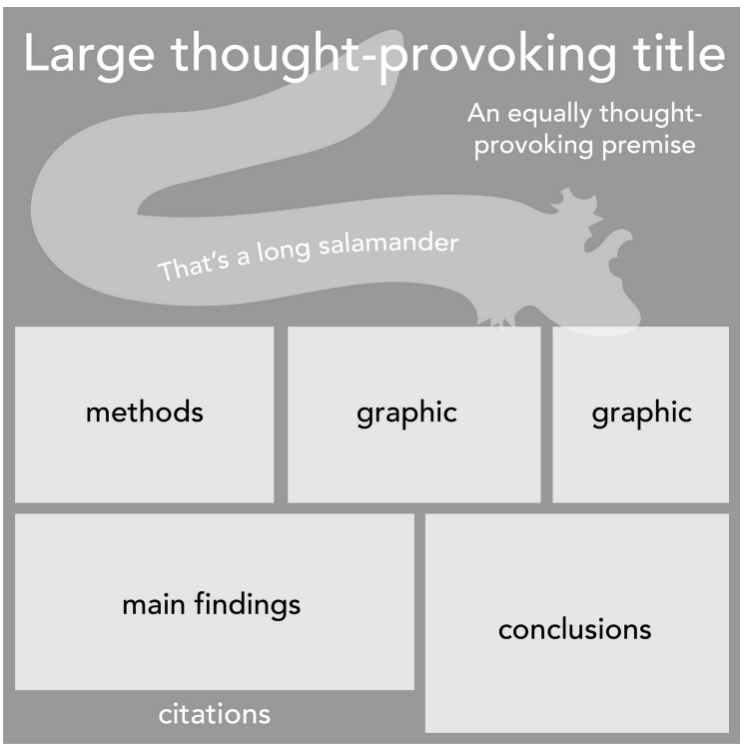
Have one, big, imposing, in-your-face, or thought-provoking image.
Everything’s in moderation - including the word count. Go for 65-80 words if you can!
Choose a layout that’s easy to follow the flow of information to convey your story.
New research papers are being published every single day.
In fact, 2.6 million papers are published every year. But let's face it; nobody has the time to read abstract after abstract to dig out what you need from all the papers out there.
So how can we digest a large amount of information in a shorter span of time?
Here's where “graphical abstracts” come in to make every researcher’s life easier.
Wait, what the heck is that?
In a nutshell, a graphical abstract is a visual summary of a written abstract. It’s a rundown of a full story within 65-80 words (ideally) that gives you a good idea of the research gap, questions, findings and conclusions, complete with pictures! It comes to show that pictures speak a thousand words faster than any written summary!
You can also think of them as a kind of movie poster, as a visual preview of what you’re about to watch. Hang them up in the hallway if you really wanted to! It’s a promotional tool! And just like a movie poster, if you’re enticed by the #aesthetic of the graphical abstract then you’re more likely to want to read the whole paper!
Even science itself backs this up.
On top of that, in the modern era of publishing, graphical abstracts are becoming more and more commonplace. Some journals even require them to publish at all. But because of this, so many researchers are tempted to recycle one of their figures as the graphical abstract. Should you do this? NO. ABSOLUTELY NOT.
Some journals may even recommend that you submit a video abstract - now you’ve got a whole movie trailer. But that’s a whole other world, and today GA’s take the spotlight.
So what makes a graphical abstract stand out? What design elements make them so effective? What about them entices you to read the whole paper?
In this blog, Juan Miguel Balbin, Science Communicator at Animate Your Science and PhD Candidate at the University of Adelaide, showcases real-world examples of effective graphical abstracts to inspire you to design your very own!
Graphical abstract appraisal
We feel that most people still don’t know what a graphical abstract should look like and a collection of great looking ones is definitely missing. To fix that, we’ve compiled and reverse-engineered five examples of well-designed graphical abstracts and discuss them one-by-one based on:
layout and design elements (the “skeleton”, like in posters!)
what could be improved?
Let’s step into the gallery!
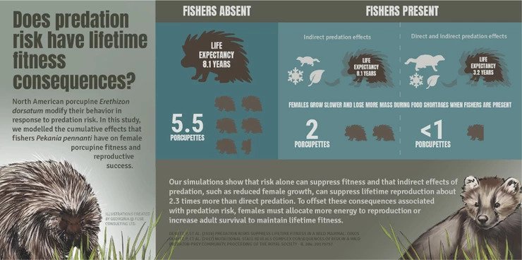
The humble North American porcupine
Produced by: Fuse Consulting
Layout and design
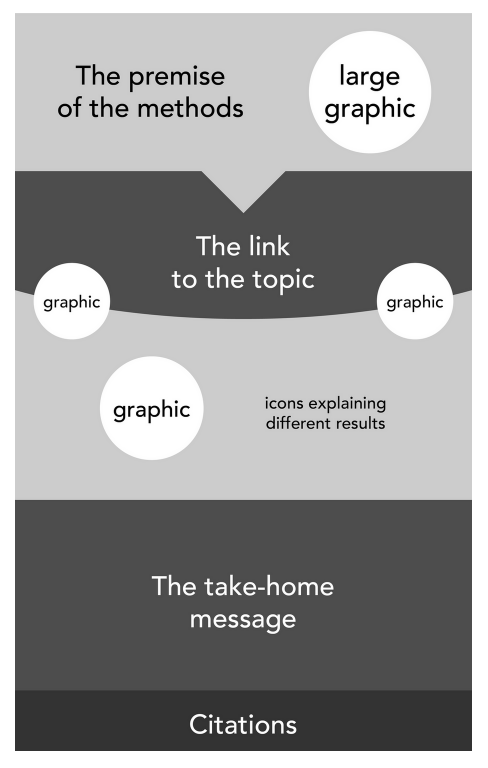
This landscape graphical abstract is split up into boxes for each category of information - so your eyes can easily process information from left to right. The research gap and question (in large font!) is the first thing you read, followed by quantitative data represented by icons, and a neat summary of the findings. Put together, it’s a full story between the humble North American porcupine Erethizon dorsatum and its opposing predator, the fisher Pekania pennanti!
Having them placed on opposite ends makes it almost feel like two oppositions in boxing ring!
Colour scheme
True to nature, there’s a lot of natural brown and olive colours from the main illustrations and provides a single light shade of green to highlight the primary data. Many of these colours were likely collected from the illustrations of the animals using the Eyedropper tool!

What could be improved?
Large paragraphs can be little difficult to digest. It would be absolutely perfect if the conclusion could be shortened into dot points or a single unifying sentence.
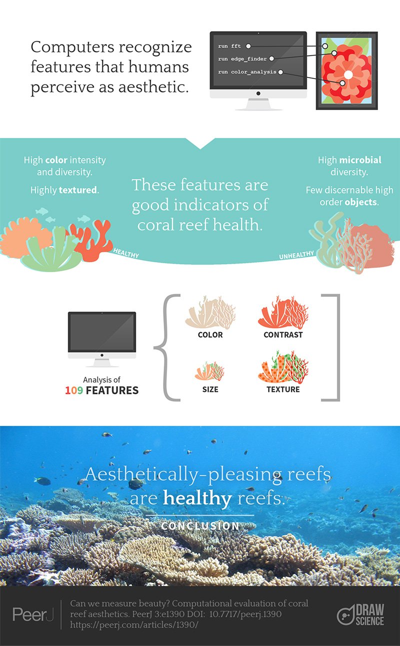
The link between good aesthetic and ocean health
Produced by: PeerJ journal
Layout and design
Four different evenly-spaced panels provide a balanced layout that uses lots of negative space (we LOVE negative space), a substantial amount of descriptive text to get the main messages. The minimalist aesthetic is a good aesthetic!
The three key messages are written in larger fonts, while supplementary information is presented in smaller fonts. This ensures the reader can easily follow the story from start to finish without being distracted by the little details!
Colour scheme
Combining illustrations with photos can often result in a jarring and inconsistent feel, but this graphical abstract manages to seamlessly use both to great effect by being consistent with colouring and scale.
True to the theme, coral pinks and ocean blues are the mainstay hues.

What could be improved?
A large title, possibly worded as a question, would help readers to sooner understand the main objective of the study. There’s many ways to make a title exciting!
Legends tell of a giant salamander
Produced by: Lucy Poley (@lucygempoley)
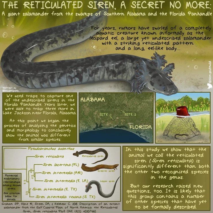
Layout and design
We preach that any infographic, whether it be a scientific poster or a graphical abstract, should have one large eye-catching image - and that’s exactly what the GIANT salamander does! It’s big, it’s imposing, it’s slimy, and it grabs the reader’s attention!
Using a playful font (and an equally playful tone of voice in the text - this is how it should be!), the graphical abstract tells a full story from top to bottom, with neatly compartmentalised boxes for descriptive text.
Colour scheme
The GA consistently uses shades of green which perfectly fit the swamp theme, and a hint of red, dark blue and dark browns work well for contrast.

What could be improved?
A boundary or margin around the text boxes and graphics would help give this graphic some much-needed negative space to give your eyes some rest. Sometimes less is more! And on that note, there’s far too many words (we counted a whopping 195!) for a visual summary - halving this would be fantastic, or if you can, aim for a short and sweet 65-80.
Putting your best foot forward!
Produced by: Taylor and Francis Group
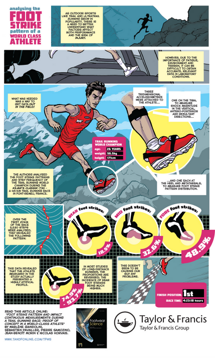
Layout and design
This cartoon abstract, as the Taylor and Francis Group calls it, is a fantastic example of a comic-style graphical abstract about world-class athletes. Each aspect of the study is contained in a separate comic panel with an accompanying illustration - from the premise, the problem, the solution, the methods all the way to their final conclusions and outcomes. To present the results, they’ve creatively chosen icons of three sections across the foot to show how their data was collected.
What’s especially neat is that they’ve used a thick empty margin to give the graphic some negative space. It’s an easy way to ensure even the busiest of graphics have somewhere your eyes can rest!
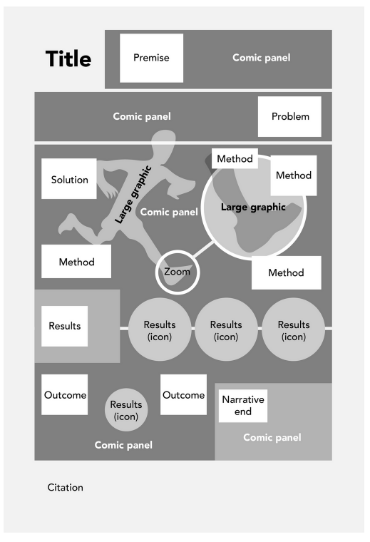
Colour scheme
We’ve got a clear contrast between the rugged mountain terrain and the bright accent colours of the athlete uniform. Since there’s so many details, good contrast is important to ensure everything is clearly visible!

What could be improved?
Understandably, scientists love to add every tiny detail about their study on the front page. But the job of a graphical abstract is just to give you a taste - a small but powerful impression, of what’s in the paper. So definitely a chop in word count is in order (it’s already >200 words as it is!). We suggest fewer text boxes be used, and that each description could be rewritten as a dot-point statement with just the key words you need!
The Female James Bond
Produced by: The AYS team together with Dr Katharina Richter (@DrKatiRichter)
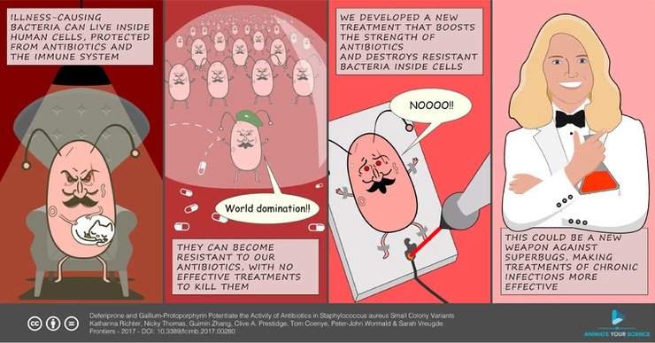
Layout and design
We used a comic style to personalise the research on the development of antibiotics against drug-resistant bacteria, and we used some classic scenes from popular James Bond films to create an engaging villain/hero narrative.
Everybody loves a good hero story!
Since the illustrations are so large, they can actually slot right into a conference poster, which is exactly what our client did! As a wonderful unintended consequence, she was stopped throughout the conference by people who recognised her as “the female James Bond” so it's a handy way to stand out from the crowd!

Colour scheme
Shades of red become brighter as you go from left to right, matching the progression of the story from evil (bacteria) to good (scientist)! There’s definitely some mood building going on here!

What could be improved?
Looking back, perhaps we could’ve illustrated each bacterium in the second panel with a different facial expression. After all, it’s the odd ones out that end up being resistant to antibiotics - just to drive that point straight home!
Take-home messages for your own GA
Have one, big, imposing, in-your-face, or thought-provoking image.
Everything’s in moderation - including the word count. Go for 65-80 words if you can!
Choose a layout that’s easy to follow the flow of information to convey your story.
We hope this post convinced you to create a graphical abstract for your next paper. If you are up for the challenge of designing your own, we’ve got more to say about the wonderful world of graphical abstracts! It is packed with useful advice!
Strapped for time?
We completely get it, and that’s why we offer our professional design services to busy researchers like yourselves! Have a look at the graphical abstracts we’ve had the joy of designing for our clients and see if we have an aesthetic that works for you!
Though If you’d like some help or don’t have the time to get to the drawing board get in touch with us!
Authors:
Juan Miguel Balbin
Dr Tullio Rossi


Should you blog about your research? What types of academic blogs serve what purpose?