Looking for inspiration for your next scientific conference poster?
By Miguel Balbin, Science Communicator at Animate Your Science and PhD Candidate at the University of Adelaide. He and Dr. Tullio Rossi are part of the team serving as Mentors in Residence for December 2021. See the related post, “How to choose a colour scheme for your scientific poster.” This post originally appeared on the Animate Your Science Blog as: Best examples of scientific posters.
TLDR
Make use of one big key visual to grab people’s attention.
Come up with a colour scheme of 4-5 colours and stick to it.
Less is more! Fewer words on print means you’ve got more to actually talk about
Imagine - it’s now 8 pm at a conference you’re attending.
You’re tired after sitting through five back-to-back sessions of graphs, error bars and statistics. You remember that one guy sitting in front of you from Session 2 who could barely keep their eyes open and someone else who spilled their coffee onto the floor.
People are tired.
But they also want to get excited again before the day ends. Free food and drink is up for grabs in the next session! What’s the next session you ask
Well of course it’s the conference poster session!
The doors to the session hall open up and you’re greeted by a literal art gallery of scientific work. Or at least, some of them could be considered art. Oh boy here we go.
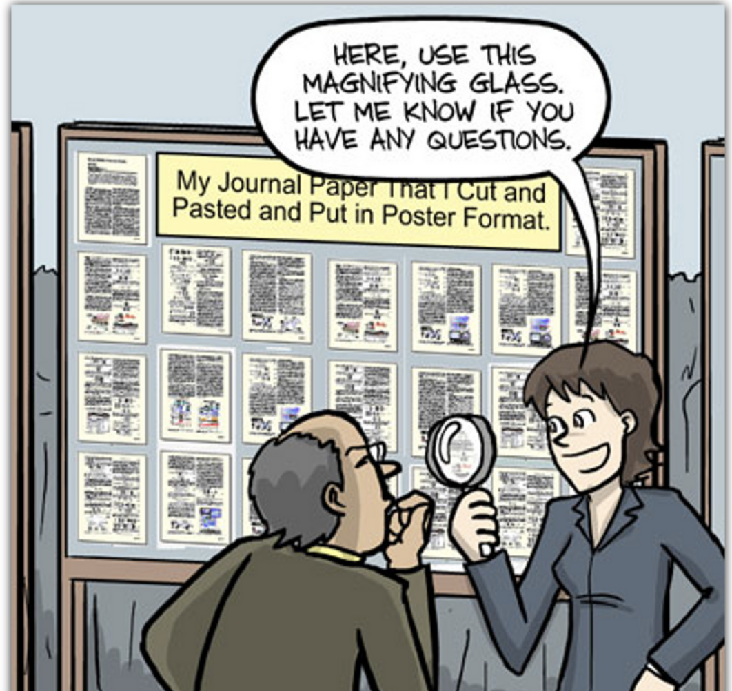
Ah no, not the person on poster #37 who pasted their PowerPoint slides onto an A0 sheet of paper.
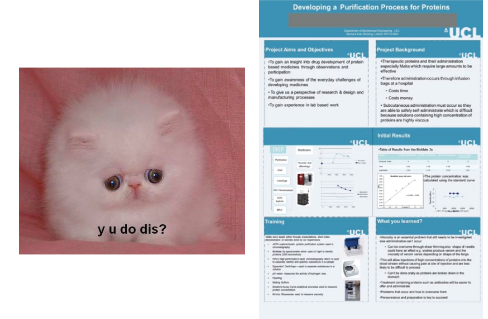
And definitely not the other person on poster #49 with that intimidating wall of text made up of manuscript pages.
Where have all the good posters gone?
Source: PhD Comics
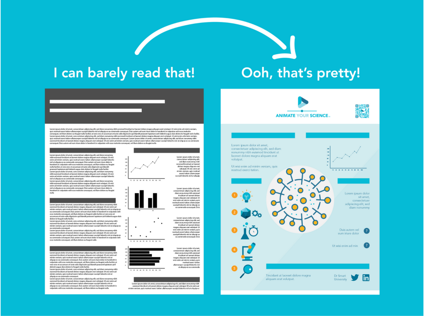
Unfortunately, not all scientific posters are visually attractive. As a result, these posters are at best less likely to strike a conversation with attendees - at worst making attendees run away from you!
A well-designed scientific poster tells everyone in the hall a lot about you: about the way you present your work, about your skills in graphic design, about the amount of effort you put into your story.
Your poster is your story.
But what is it that makes a poster really stand out? What design elements catch your attention from across the room? What makes you want to start that conversation with the presenter?
In this blog, Juan Miguel Balbin, Science Communicator at Animate Your Science and PhD Candidate at the University of Adelaide, showcases real-world examples of good scientific posters, appraises them from a design perspective and reverse-engineers their components.
A good poster leads to a good first impression
If you believe your research is ground-breaking, then it deserves to be recognised with some added polish!
Your poster is your ultimate networking tool. It’s your secret weapon for when you’re trying to catch the eye of that hotshot professor who you want to collaborate with (or get in touch with for that post-doc position in the Swiss Alps). Unfortunately, that hotshot professor is likely a very busy person and is cherry-picking who they want to talk to before they disappear off to the bar, wine glass in hand.
You’ve got to make sure you get noticed before that happens. And what better way to show off your colours than with your scientific poster?
Poster appraisal
Here we showcase four examples of very well-made scientific posters from real-world research. They incorporate several design elements that we discuss in our How to Design an Award-winning Poster course - our tried and true recipe for success! Here, we will reverse-engineer and highlight the merits of each poster one-by-one and highlight:
first impression (gotta express my feelings about art, you know?)
title
colour scheme (with a palette you can use on your own poster using the Eyedropper tool)
layout (the “skeleton” of a poster)
figures
other features of note
what could be improved?
Let the artshow begin!
Example #1: James Bond vs. Superbugs
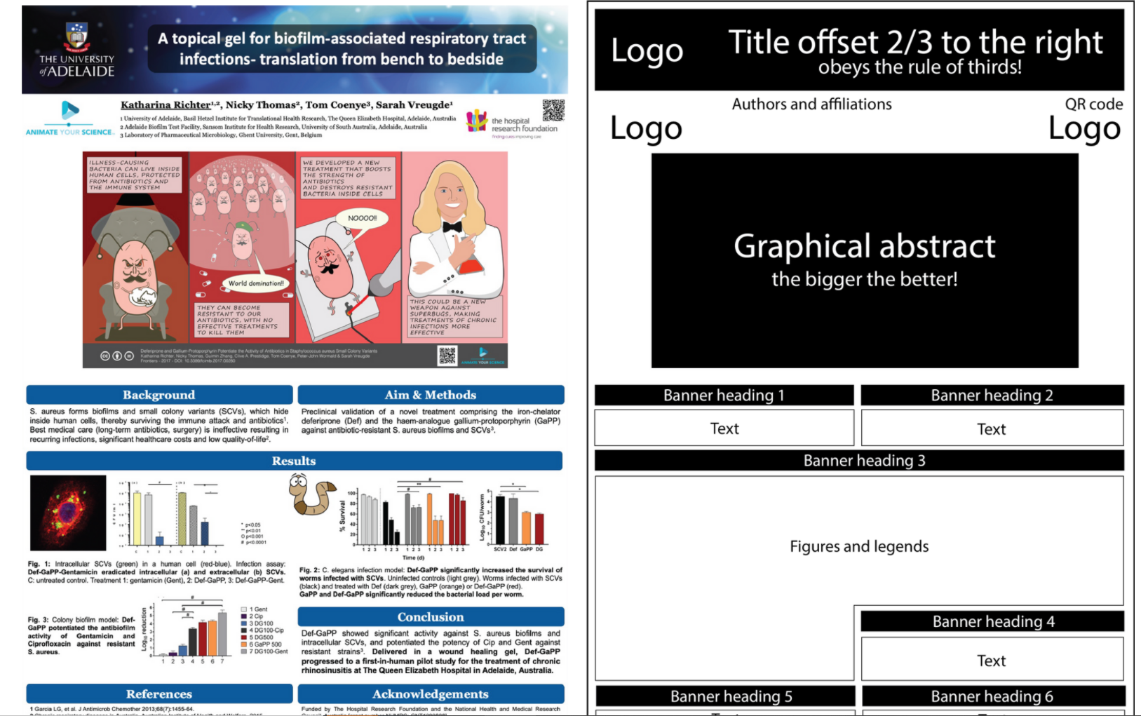
by Katharina Richter
First impression
Right off the bat the thing that really catches your attention is the graphical abstract designed like a comic-book strip. A poster can serve as entertainment just as much as it can communicate science! Who wouldn’t want to overturn an evil mastermind superbacterium?!
This poster was so successful and memorable that Dr Katharina Richter was contacted by attendees afterwards, referencing her as “the female James Bond”. Now that’s one way to make a lasting impression!
The results? A new collaboration, a co-authorship and an invitation to write a book!
Title
To the point and uses catchy alliteration - from bench to bedside. Not littered with jargon, and is between 5-15 words. It’s also positioned 2/3 to the right, which is a visual hotspot in photography theory according to the rule of thirds.
Colour scheme
Blue’s the theme here. To contrast, the splash of red as an accent really draws your eyes in onto the graphical abstract from far away. Headings are very clear with the contrast between white and blue.

Layout
The most eye-catching posters will have a picture that takes up a large chunk of the page as the focal point, which is exactly what the graphical abstract is doing.
Text is minimal and is straight to the point. With short sentences, you won’t get lost while reading.
Sections are neatly split in two columns and have a consistent margin thickness to keep it neatly aligned and tidy! Your eyes can easily follow the intended order of sections from left to right.
Figures
A small handful of figures that have your key findings are all you need.
If you’re standing by your poster, you also don’t need any pre-amble text for your figures. You do the talking, the figures will figure the rest out (pun unintended, I promise!). The figure legends are enough to inform passing readers, who will then want to follow up with you after!
Other features of note
QR codes are the symbol of a modern science poster! You’ve given people the prologue to your story, why not link them to the rest of the adventure in the manuscript?
What could be improved?
The layout would benefit from more negative space for your eyes to rest on. It can also be easy to get lost in a paragraph, so increasing the spacing between lines would also help generate more negative space.
Example #2: Fancy a finch?

by Caterina Funghi
First impression
My eyes are instantly drawn to the beautiful photo of the finch from across the room - you know what the study is about without even reading the title!
Title
Yet more clever alliteration between the words flexible, foraging and finch. It neatly summarises the study within 5-15 words in a large font size for increased visibility in the conference hall!
Colour scheme
The author of this poster was clever to base their colour scheme on the photo of the finch, thanks to the handy eyedropper tool! The earthy colours come from the head (gray-brown), cheek (white), tail feathers (gray-black) and beak (orange).
Layout
A neat white margin hugs the poster from all sides, and while aesthetically pleasing it also doubles as a bleed margin for printing.
Rectangular textboxes are staggered across the poster to neatly scaffold each piece of information - this makes it easier to follow. Do you notice how the shapes of these rectangles are sized so that they neatly surround the shapes of the finch? Even the text is justified in a way that it doesn’t overlap with the finch. This is a useful technique when you’re using adding text next to images that have an irregular shape.
Figures
This poster is a great example of what posters are meant to do - showcase the best of your data. And no this doesn’t mean all of your data! With only a handful of figures, your take-home messages are more likely to land.
The graphs also neatly incorporate the colour scheme into the data points. All praises to you if you do this, don’t be lazy!
Other features of note
A divider is used to package all of the meat of the poster into one block. This ensures everything outside of the divider except for the title is untouched from clutter and ensures that there’s negative space.
Having a solid colour for the poster with minimal clutter and large spacing will ensure your eyes don’t get lost, and that the photo stays as the primary focal point.
What could be improved?
Honestly, it’s hard to critique this one! Though if I were to pick a point, it would be to have a small take-home message section that summarises your study and its conclusions. The font sizes should be consistent throughout the figures as well.
Example #3: All about crabs!
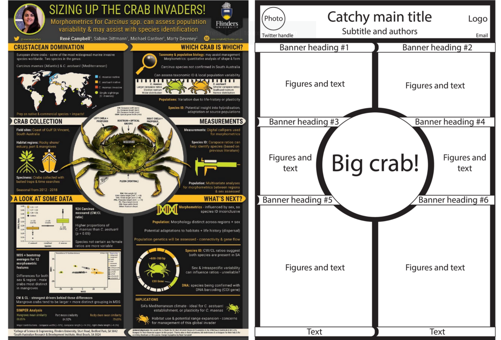
by René Campbell
First impression
We’re starting to sense a pattern here. You guessed it - that big ol’ crab in the middle makes for one big first impression! The poster overall is beautiful with loads of different kinds of visuals - there isn’t a single boring-looking section!
Title
Clever use of a double meaning main title - “sizing up” referring to evaluating, or critically assessing, as well as in reference to measuring crabs in the study. The job of the main title is to catch your attention. Below that, there’s also a subtitle where you can add the nitty-gritty details of your study.

Colour scheme
A vibrant display of three accent colours are used equally across the poster, contrasting with the black. Guess where they got the colours from? That’s right, using the eyedropper tool on the crab!
Layout
Here we have a two column layout, similar to Example #1, with cleverly titled headings. Note that none of the headings are your typical “Introduction”, “Results” and “Conclusion”. Instead, each title is written to show some personality. Save the formal headings for the manuscript!
Like Example #2, the text is neatly justified around the center circle so everything fits nice and snug!
Figures
Have you noticed several bits of text are accompanied by a symbol or icon? Icons are fantastic for giving each section some visual context, i.e. a boat to describe how they collected their crabs. Pictures speak for you!
All of the data has also neatly incorporated the accent colours to ensure they stick out. And by limiting it to just two graphs, it sticks out even more!
Other features of note
Remember - your poster is a networking tool, so give people ways to find you! Twitter is the home of academics on social media so add your Twitter handle and a photo!
What could be improved?
Like with Example #1, more negative space is needed especially with a busy black background. I would merge the methods sections together and have one space to rest your eyes on. Less is definitely more!
Example #4: Cheese is serious business!
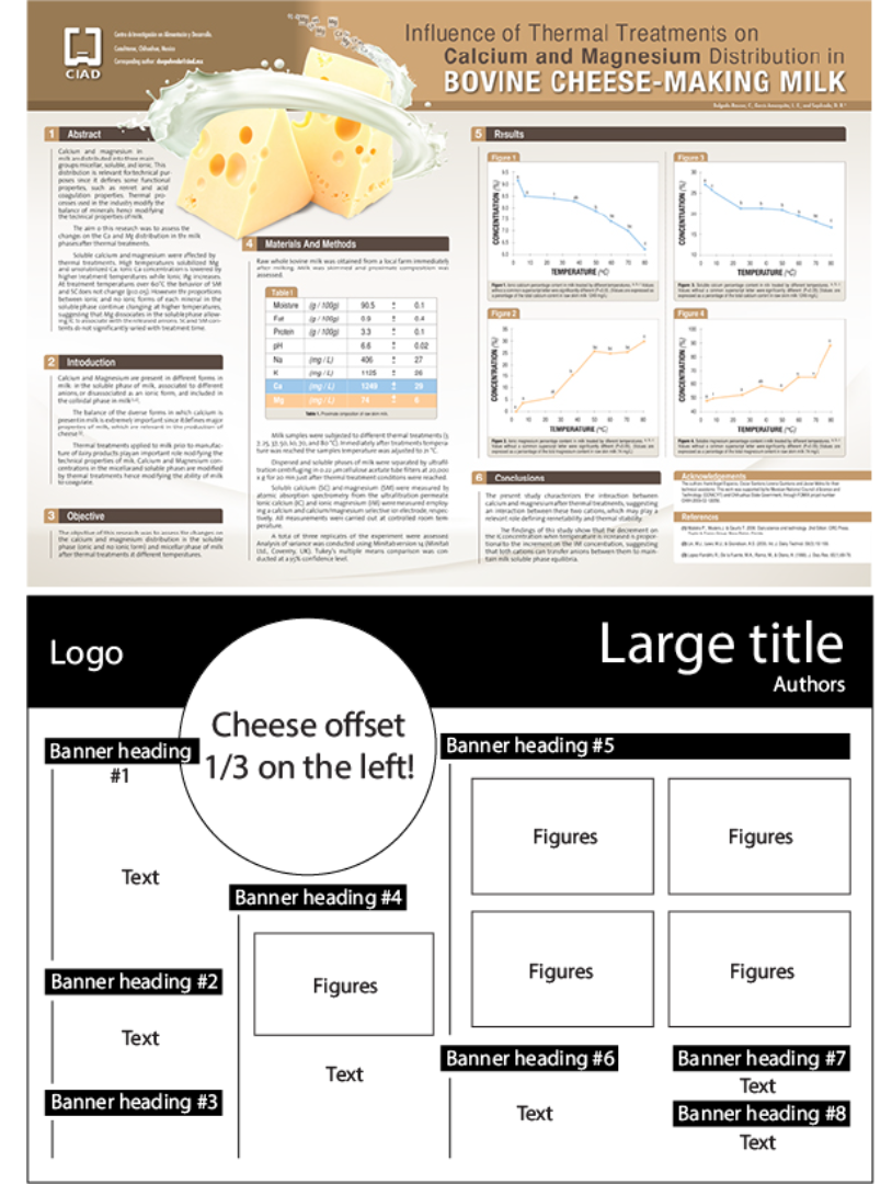
First impression
Did you see those 3D effects on the milk around the cheese? Now that’s the sort of picture that literally pops out of the poster! I’d definitely want to follow up with this presenter.

Title
Different parts of the title are in bold or a different colour to make each separate variable in their study stand out. From a distance, you can easily see “Bovine cheese-making milk” as the main topic, with the remainder of the text in a darker colour.
Colour scheme
Earthy colours are, in my opinion, less distracting (and less stressful on your retinas) than brighter, more vibrant colours. Instead, it allows accent colours to pop out more, as you can see with the baby blue highlights and the vibrant yellow cheese.
Layout
With a landscape poster you can afford to scaffold your sections in more columns, in this case four. Spread out, people! And despite the relatively hefty amount of text, there’s a neat margin between sections that allow your eyes to rest on negative space.
Also much like with Example #1, this poster respects the rule of thirds by placing the big cheese 1/3 across the page to make it more visually striking.
Figures
The graphs and table have neatly incorporated the primary and accent colours of brown and baby blue (a round of applause to the presenter for opening up their graph files to change the colours just for the poster!).
Having the graphs be large and imposing makes them much easier to read and interpret. They’ve also neatly tucked the figure legends underneath the graphs to package it all together in a neat box. You won’t be confused as to which legend goes to which figure!
Other features of note
If your supervisor insists on having a fairly large amount of text, do what this poster does and indent your text into paragraphs. With an indent, you’ll know where one paragraph ends and where the next one starts, and you won’t get lost in the sea of words!
What could be improved?
Definitely chop down the words (if you can resist the temptation) and up the body text font size! You know how people win prizes for those competitions that ask you to describe something in 150 words or less? You’re also more likely to get that prize at a conference with this same tip. Let’s try with <250 words to begin with.
Take-home messages for your next poster
Make use of one big key visual to grab people’s attention.
Come up with a colour scheme of 4-5 colours and stick to it.
Less is more! Fewer words on print means you’ve got more to actually talk about
Are you excited to put some ideas into practice for your next scientific poster? We go into far greater detail about making your posters amazing in our How to Design an Award-winning Poster course, so check it out! And if you found this blog useful, please consider subscribing to our newsletter!
Until next time!


Should you blog about your research? What types of academic blogs serve what purpose?