How to present numeric data
By Dr. Stephen Gorard, author of How to Make Sense of Statistics. Use the code MSPACEQ423 for a 20% discount through December 2023.
When we and others report our research, our purpose must be to explain it as simply as possible to gain the widest possible comprehending readership. This permits people to appreciate and use our research findings, leading to the widest possible opportunity for critique or replication, and so to improvements in our field of research. The act of converting our findings into a simple report format also helps us to understand our own work and its limitations better.
The first and most important issue in presenting research results is clarity of writing. If a research report is easily readable then it becomes easier to judge the information within it (see my post on judging the trustworthiness of research). This means using no long words unless absolutely necessary, no unfamiliar new terms, and no long sentences and paragraphs (the over-use and incorrect use of semi-colons is often a symptom of this). The job of the writer is to work hard to help the reader to read their writing. There is no reason not to portray research as simply and accurately as possible.
Issues of presentation

Perhaps the most obvious place to start with numbers is how long they are. Longer numbers are harder to read, just like longer words and sentences. We cannot control the scale of the numbers in our research, but we can present them succinctly. Whole numbers can be described in terms of hundreds, thousands or millions. Decimal fractions should appear with a sensible number of “significant figures”. In social science most measurements are not tiny decimal fractions, so this is really a question of using the minimum number of decimal places necessary.
Tables are the staple method for presenting multiple numeric results. Tables of simple figures can be extremely useful and informative. They present more precise figures than graphs, and can be designed so that the message for the reader is easy to spot. This is the key over-arching point for both tables and graphs. Their purpose is to be part of a larger narrative. They should illustrate an important point in that narrative, where that point cannot be made as easily via text. This narrative point could be that value A is growing over time, or lower than value B, or the best predictor of value C, to list just a few examples.
As far as possible, there should be only one figure per table cell, nothing in brackets within any cell, and ideally only a maximum of two dimensions, represented in a two dimensional table. The number of cases must be obvious in or near the table. The row and column headers should be clear and meaningful. You might have to use acronyms or abbreviated variable names in your dataset, or capital letter names to suit your software. But these should not automatically become row titles or column headers. Put another way your results should not be undigested output from analytical software (R, STATA, SPSS or whatever).
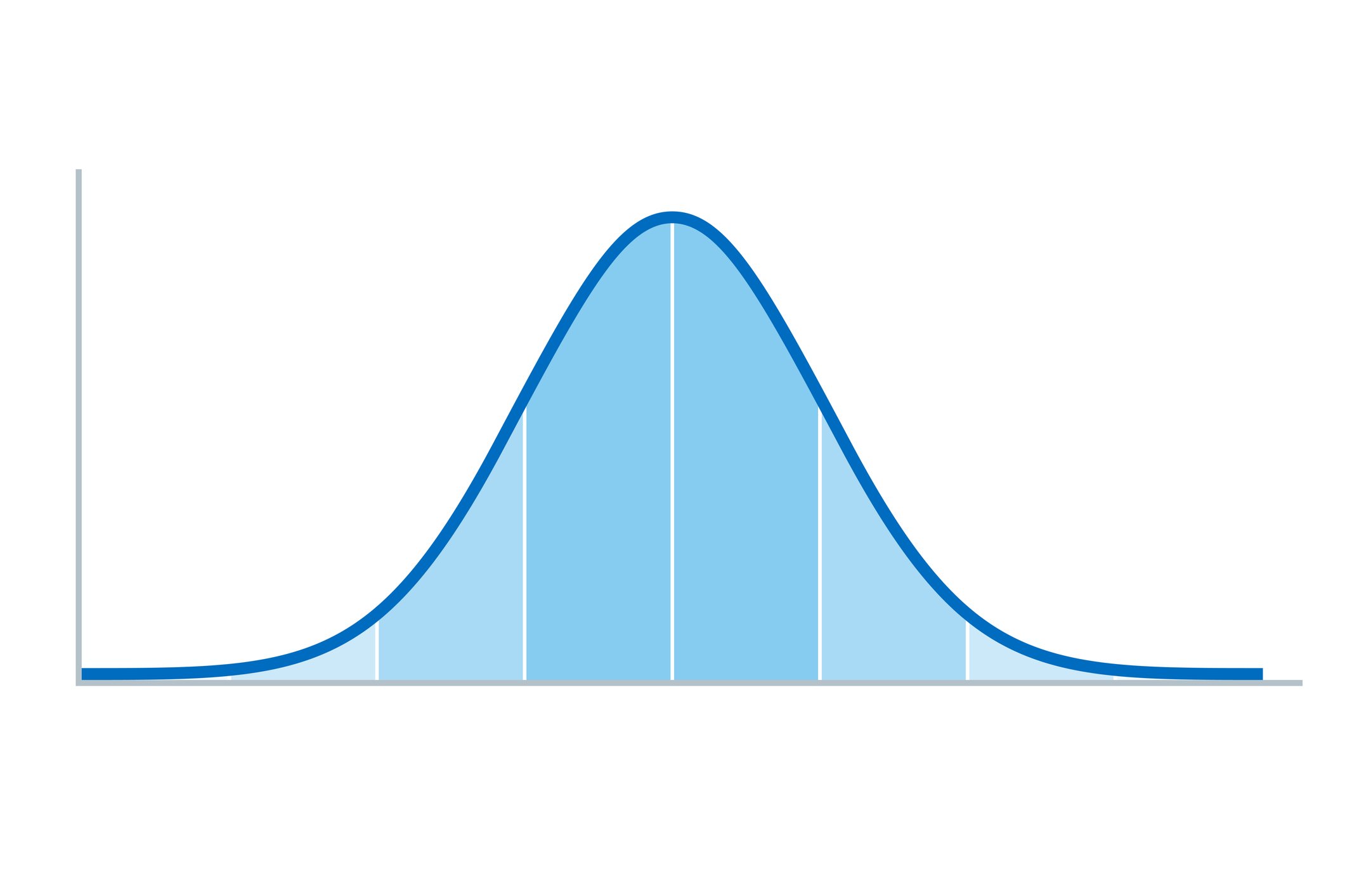
Many of the same points apply to graphs and their labelling. Use the correct format graph for the point you want the reader to grasp (easily). Generally, do not use pie charts, 3D graphs of any sort, or too many colours or formats. The main menu for everyday choice should be histograms/bar charts, scatterplots or line graphs. Do not have many lines in one graphic display, or lots of categories within the towers of your histograms, and so on. People will not understand them.
A real-life example
Here is a real example of an unnecessarily confusing style of presentation that is actually quite widespread (this is just one example).
The study used 461 school students’ reports of life satisfaction as an outcome variable for a regression analysis. There were three self-reported measures as predictors of life satisfaction, listed as “hopelessness”, “absorption” and “efficacy”. The results in the table below are rather difficult to read. There are lots of cells, many of them empty but some with more than one figure, and some technical terms and abbreviations. The figures are presented to three decimal places.
Results of multiple regression analysis related to prediction of life satisfaction
Predicted Variable
Analysis Phase
Predicting Variables
B
Standard Error
Beta
t
p
Zero-Order
ΔR2
Life Satisfaction
CONSTANT
17.143
2.155
7.954
.000
HOPELESSNESS
1
R= 0.416 R2= 0.173
-.515
.067
-.329
-7.674
.000
-.416
.173
F (1, 459)= 95.855*
ABSORPTION
2
R= 0.489 R2= 0.239
.405
.073
.243
5.553
.000
.358
.067
F (2, 458)= 72.076*
EFFICACY
3
R= 0.496 R2= 0.246
-.136
.067
-.089
-2.039
.042
-.254
.007
F (3, 457)= 49.768*
**p<. 05
The paper reports the participants thus:
The research group is comprised of a total of 461 students... who have voluntarily accepted to participate in the study and who continue their 12th grade education during the 2011-2012 school term at varying types of high schools.
There is no mention of how many of the cases approached refused to participate, and how many dropped out or provided unusable data. The sample is clearly a convenience one – rather than randomised. This means that, as in the first example, there should be no reports of significance tests, standard errors or p-values. The table columns labelled Standard Error, t, and p (the p-value) can therefore be deleted, and safely ignored. They mean nothing in this context, and should not appear. We can also remove the footnote about p, and the rows containing F values. Again these are all to do with significance tests which are meaningless, and misleading, here.
The first column naming the outcome variable is covered by the table title, and the variable names for each “Analysis Phase” can appear in the same line as their results. Given that there are only 461 cases, no estimate of missing data, and the variables are attitudinal scores, it also makes sense to reduce the number of decimal places to avoid suggesting a spurious accuracy. It is good form to put a zero ahead of the decimal place when a number is only a fraction, and use the + signs as well as – if figures can be either positive or negative. The constant can be noted as a footnote to the table, instead of having a nearly empty row just for that. And the column headers can be made more meaningful. Making all of these changes leads to a much simpler version.
Results of multiple regression analysis related to prediction of life satisfaction
Blocks
Variable entered in each phase
Regression coefficient B
Standardised coefficient beta
R-squared “effect” size
Increase in R-squared
1
Hopelessness
-0.52
-0.33
0.17
0.17
2
Absorption, Hopelessness
+0.41
+0.24
0.24
0.07
3
Efficacy. Absorption, Hopelesness
-0.14
-0.09
0.25
0.01
This contains the same amount of useful information. Nothing has been lost. Here it is clearer to see that this is a regression model with three blocks. The first block uses only one predictor (hopelessness) which can predict around 17% of the variation in life satisfaction. The second version uses two predictors, and the addition of absorption increases the model to 24% (R-squared of 0.24). Adding a third variable (efficacy) then makes little difference. Whether these three attitude variable can really be said to predict a fourth (life satisfaction), based on a survey in which all four attitudes were collected at the same time, is debatable. It is not clear what this association really means, or what use the results are. As before, looking for the meaning of the finding is the true analysis, and is what the report author could have done with their time, instead of using significance tests and other red herrings.
Stephen Gorard is the author of How to Make Sense of Statistics, Professor of Education and Public Policy, and Director of the Evidence Centre for Education, at Durham University. He is a Fellow of the Academy of Social Sciences, and a member of the Cabinet Office Trials Advice Panel as part of the Prime Minister’s Implementation Unit. His work concerns the robust evaluation of education as a lifelong process. He is author of around 30 other books and over 1,000 other publications. Stephen is currently funded by the British Academy to look at the impact of schooling in India and Pakistan, by the Economic and Research Council to work out how to improve the supply and retention of teachers, and by the Education Endowment Foundation to evaluate the impact of reduced teacher marking in schools. Follow him on Twitter @SGorard.
More Methodspace Posts from Dr. Stephen Gorard


Find tips to help you share your research and numerical findings.